
FASHION MINGLE
Improving Usability and Brand Consistency for Fashion Mingle’s Most-Visited Pages
01 OVERVIEW
Timeline
Jun 2025 - Aug 2025
Project Type
Website redesign
Challenge
Fashion Mingle's Identity Crisis: Great Features, Unclear Value
The existing website, while functional, does not fully communicate Fashion Mingle’s value proposition or provide an engaging experience that encourages users to join and subscribe.
Additionally, with the launch of the career hub–a central feature for job opportunities, collaborations, and professional growth–the platform requires a refreshed identity and user experience that resonates with modern fashion professionals.
How Might We…
Redesign the website to transform Fashion Mingle from a service-based directory into a dynamic, subscription-driven community and career hub, helping fashion professionals connect, grow, and thrive in the global industry?
Solution
"Authenticity, Clarity, and a Reason to Subscribe"
To address Fashion Mingle’s challenges and support its transition to a subscription-based model, our team executed a strategic website redesign that better reflects the brand’s purpose, strengthens its identity, and drives user engagement within the highly niche fashion industry.
The redesign included several key updates:
Homepage refresh
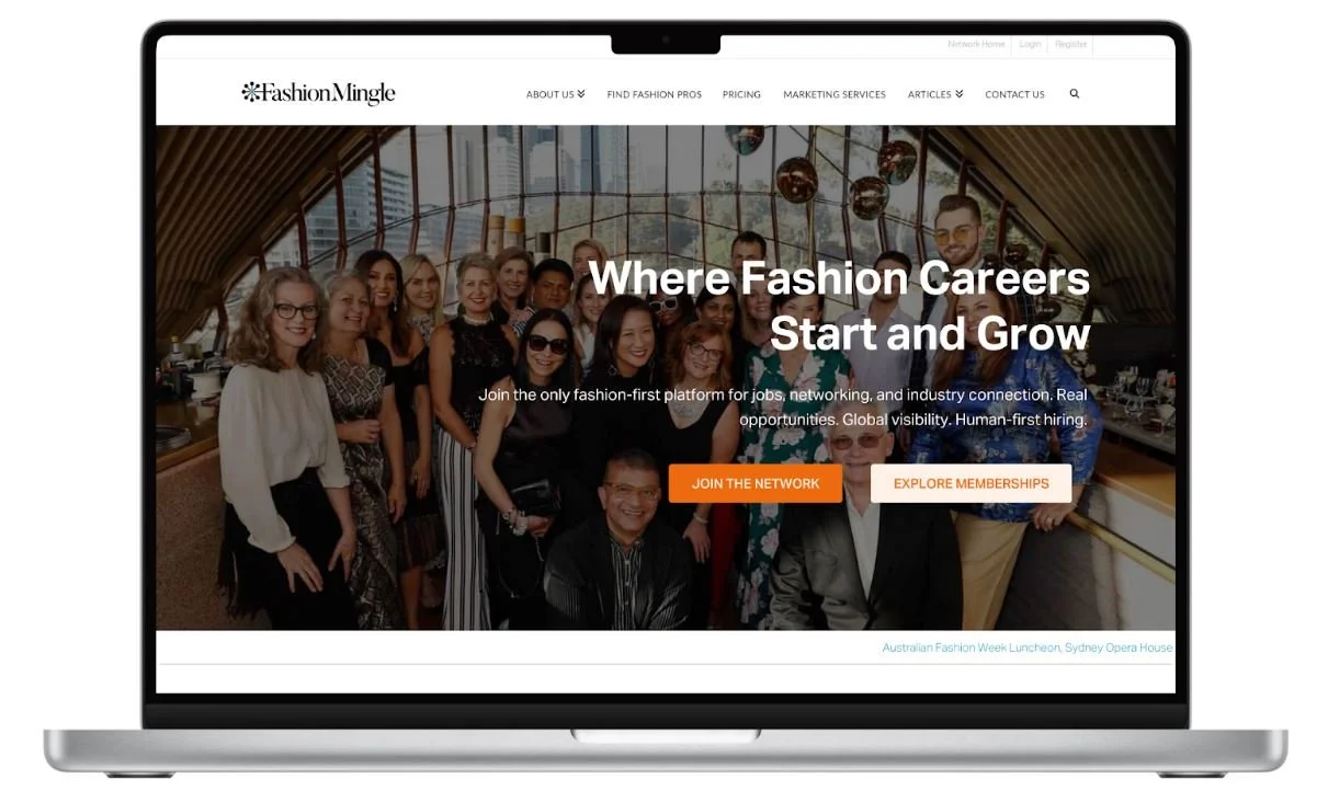
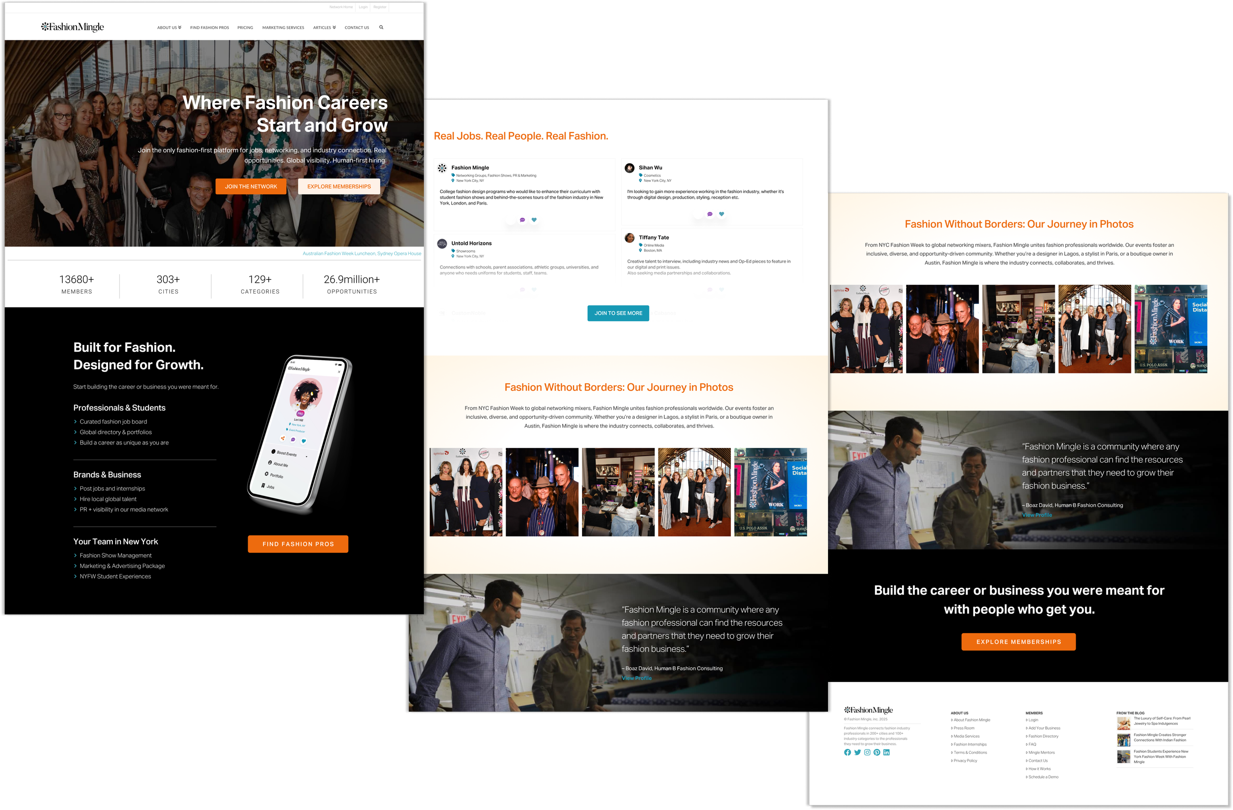
Replaced the generic stock hero image with an authentic Fashion Mingle community photo from a luncheon in Sydney, Australia, reinforcing the brand’s credibility and commitment to fostering real industry connections.
Career hub integration
Introduced a “Join to See More” restricted content view, designed to encourage registrations and highlight the value of subscribing for access to exclusive career and event opportunities.
Brand storytelling
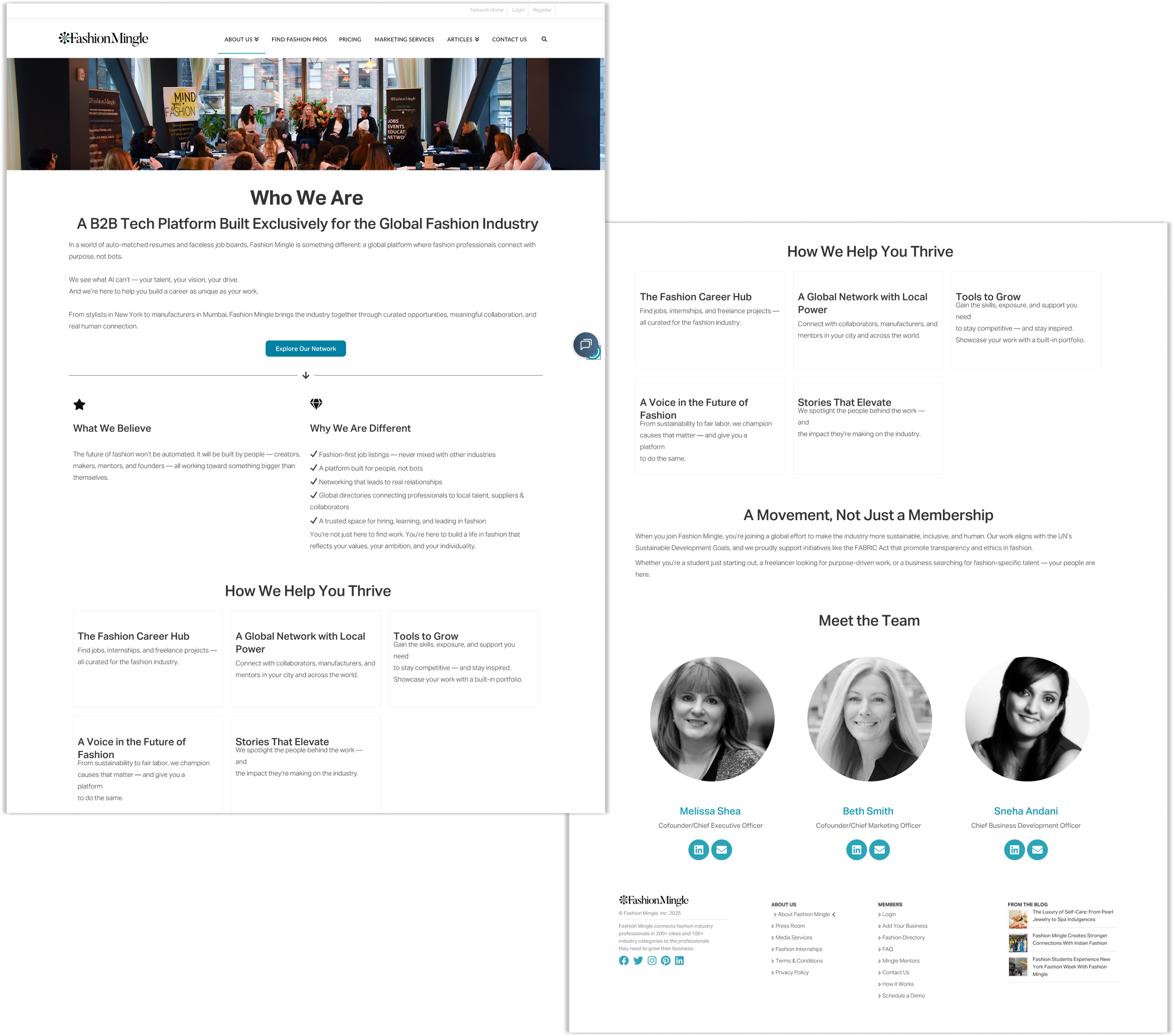
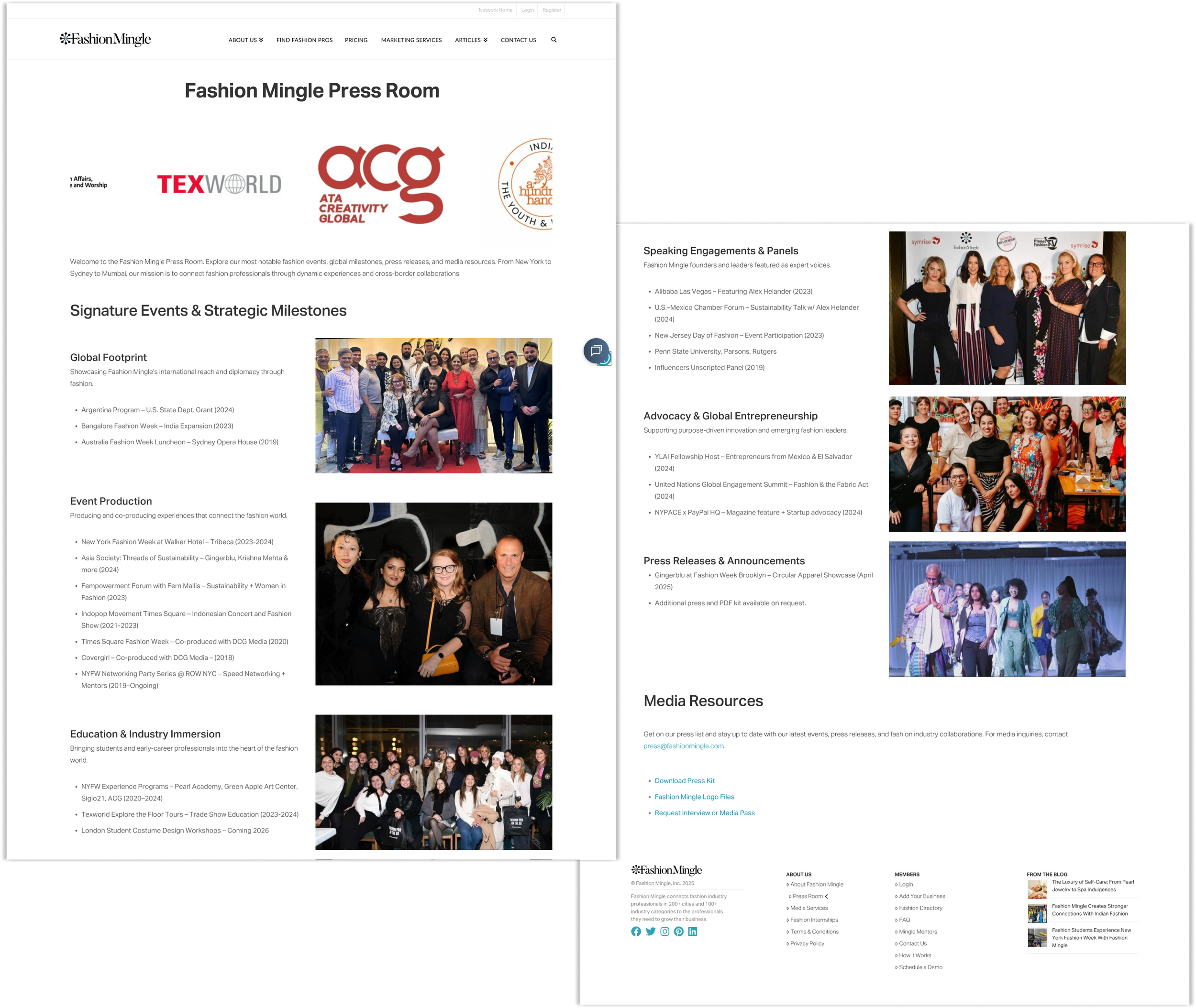
Revamped the outdated About Us and Press Room pages to more clearly communicate Fashion Mingle’s mission, purpose, and differentiation as a community-built hub created specifically for fashion professionals.
Through these updates, Fashion Mingle’s website now offers a more authentic, engaging, and conversion-focused experience; transforming it into a trusted career hub that caters to the unique needs of fashion professionals navigating this highly specialized industry.
Role
Sole UX/UI design intern
Team
C-Suite staff, 1 developer
02 RESEARCH
Competitive Analysis
What makes Fashion Mingle stand out as a networking tool for the fashion industry?
Because the fashion industry is a niche market with unique professional needs, I conducted a competitive analysis to identify strengths, gaps, and opportunities compared to other platforms serving fashion and creative professionals.
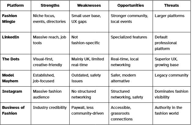
Based off of the competitive audit, I gathered key insights for Fashion Mingle’s UX strategy:
Differentiate on community: foster real-time discussions, member activity, and visible user engagement to feel more alive than a static directory.
Leverage local: build local communities with events and location-based networking, which global platforms often lack.
Inspire action: focus on small, meaningful Call To Actions (connect, message, join us as a member) to help users build professional momentum.
Receiving User Feedback
Users Struggled to Understand the Platform's Value
Upon landing on the most visited pages on Fashion Mingle’s website–the homepage, about us page, and press room page–our users responded, “It’s evident that the site offers a lot of interesting features, but I didn’t quite understand how it could be useful for me.” This suggests that there’s an opportunity to improve the website’s navigation and presentation to ensure that users immediately understand how the platform can benefit them. One user also stated that we, “add more pictures to the front page to give more of a visual of how they [the user] will succeed using Fashion Mingle.”
Fashion Mingle’s User Groups
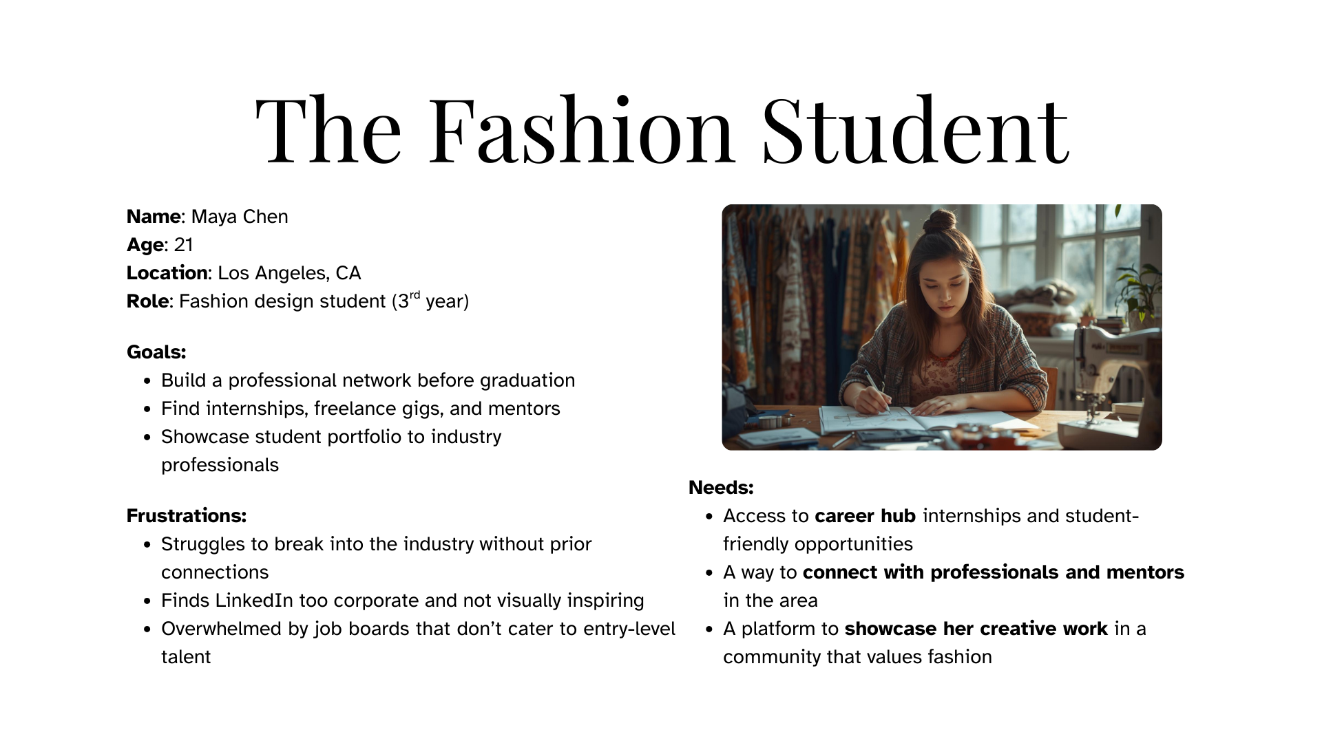
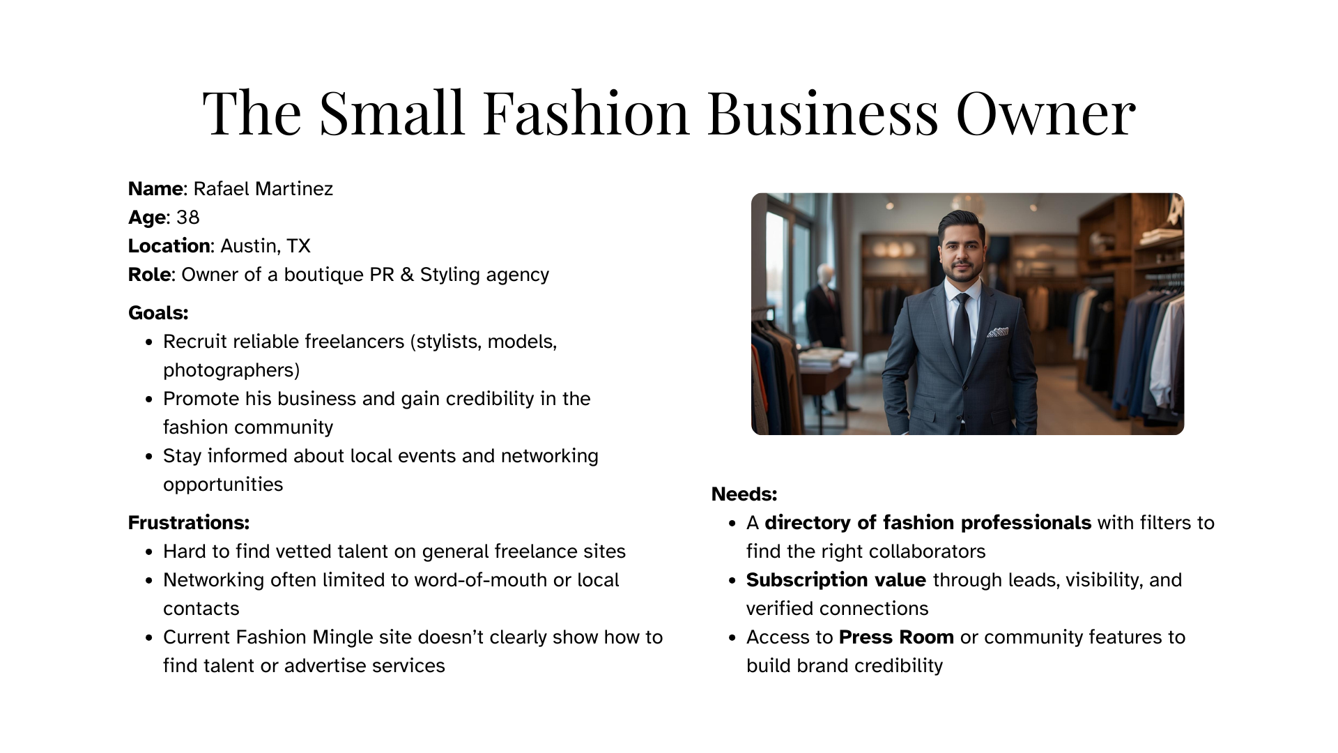
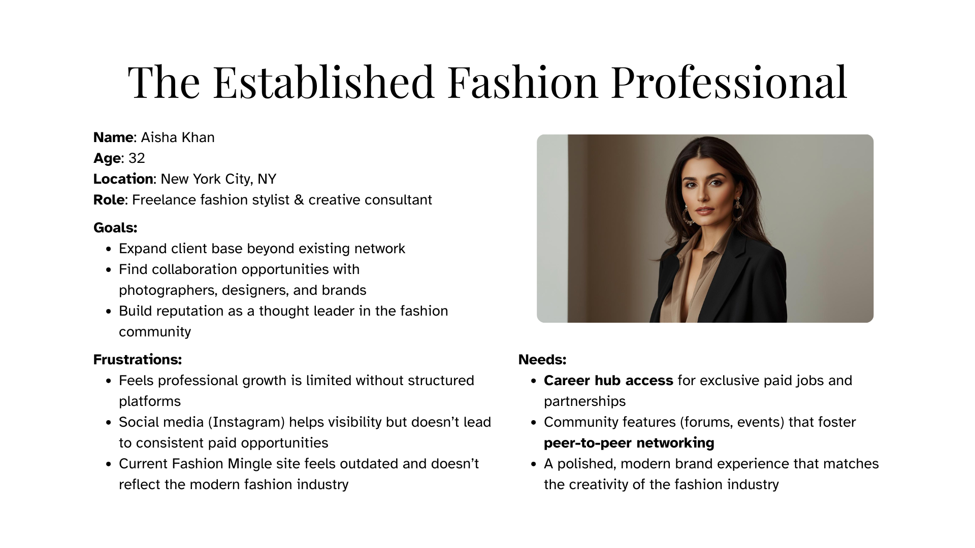
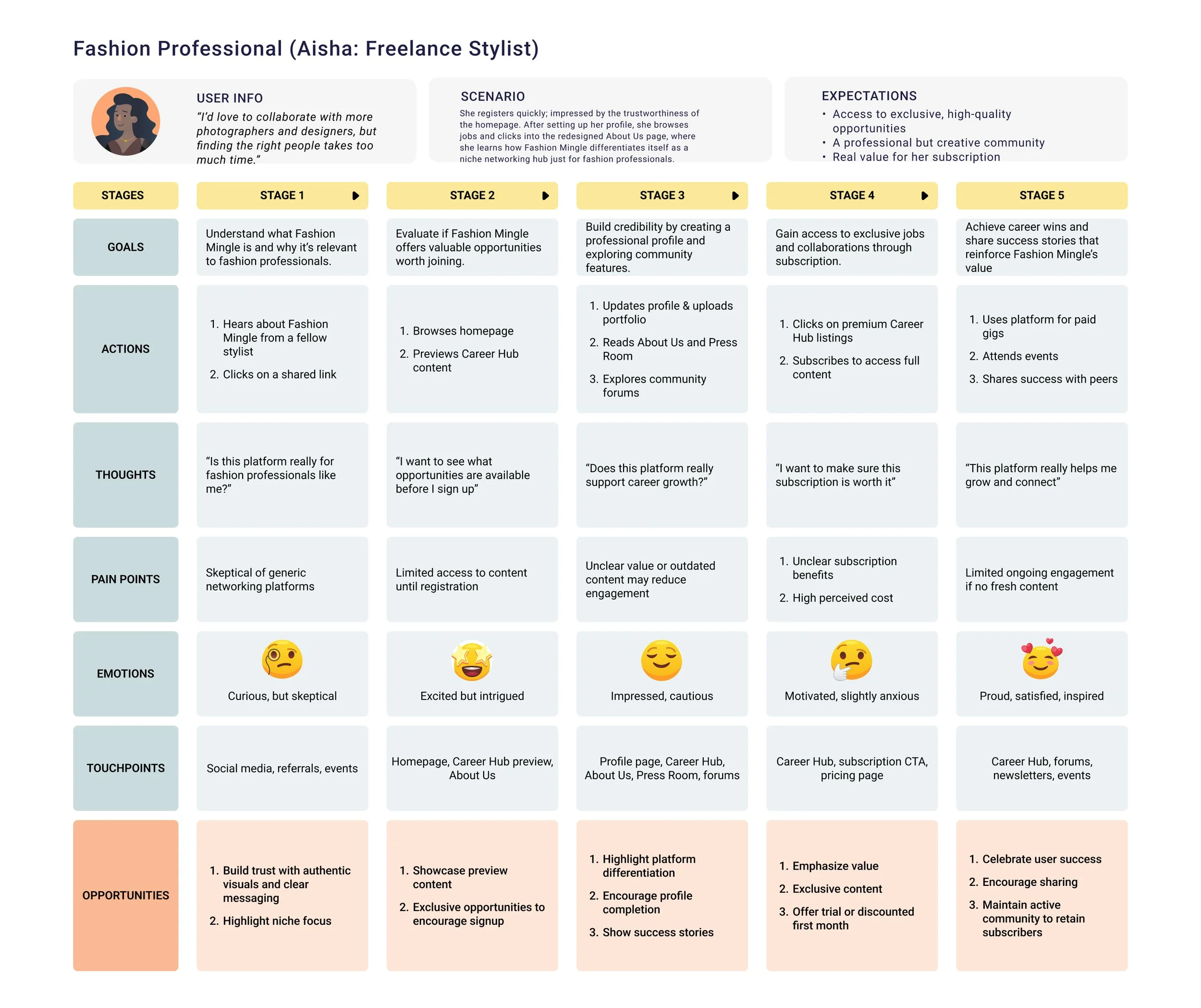
The users that are most likely to visit the platform–looking for opportunities–are students, businesses, and fashion professionals.
I created a few user personas and a user journey map to target these main segments.
AI in My Process
Using AI to Explore, Human Judgment to Decide
During the ideation stage, I integrated AI tools as a creative partner to quickly generate alternative homepage layouts and content strategies. This allowed me to explore multiple directions efficiently, compare competitor patterns, and identify gaps in Fashion Mingle’s existing design. While AI helped spark ideas, I applied my own UX judgment to filter, refine, and align the concepts with Fashion Mingle’s brand refresh goals. This process directly informed improvements such as replacing the stock hero image with authentic community photography, adding a slideshow section highlighting community events and opportunities, and introducing restricted content previews in the Career Hub section to drive user registrations.
03 DESIGNS
Wireframes
Using the original Fashion Mingle website for reference, I began creating wireframes for the website’s homepage. This process allowed me to quickly explore ideas and fine-tune the design. Below are my first two versions of wireframes I created:
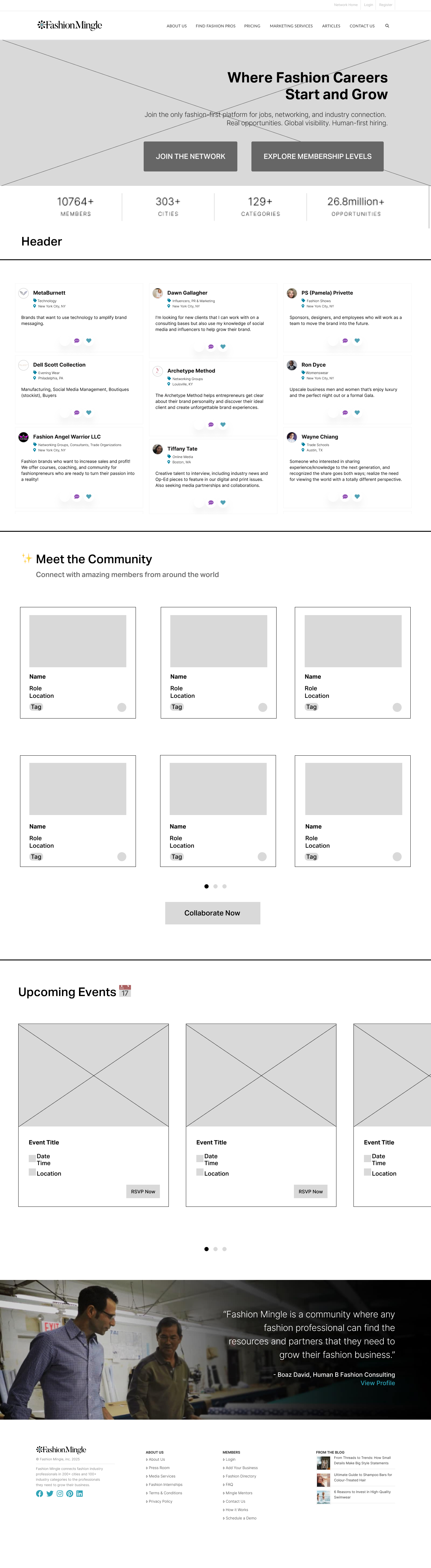
V1 features:
Meet the Community/Members Spotlight
Paid members who need more promotion; do some mockups for the content
Combine with content in the live feed
“Upcoming Events” Strip or Hero Feature
Carousel of 2-3 events (IRL + virtual)
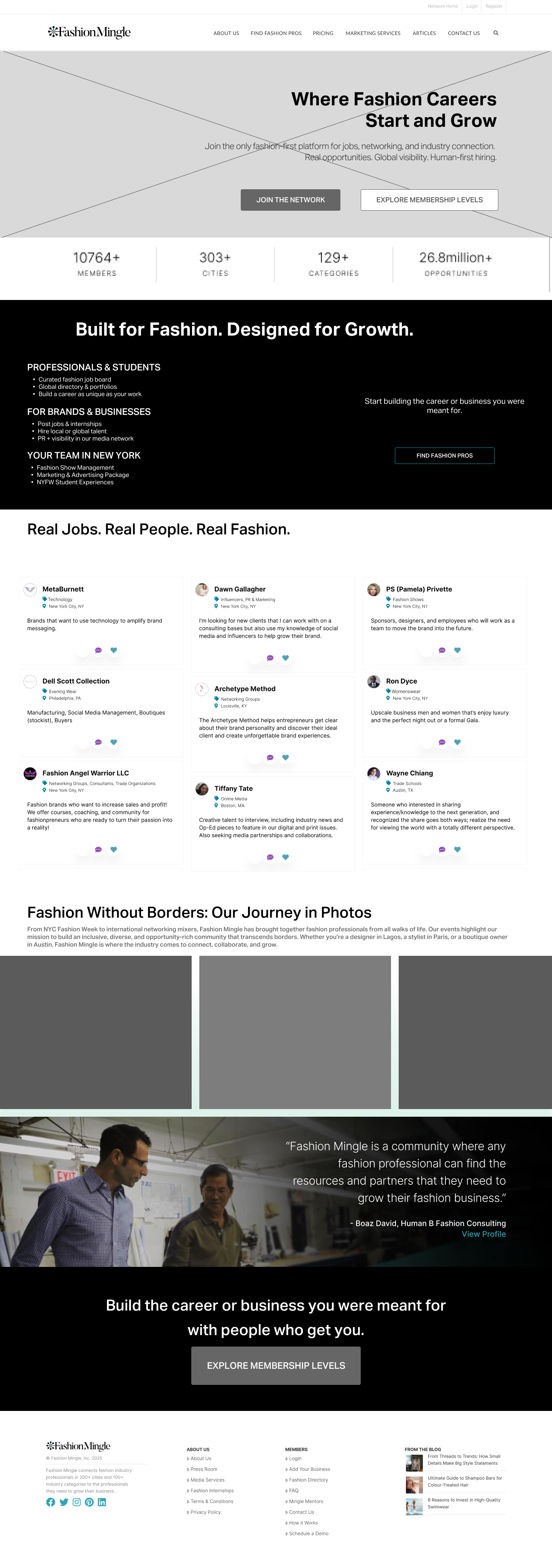
V2 features:
Iteration -
Meet the Community/Members Spotlight
Infinite scroll image slider
UI Design
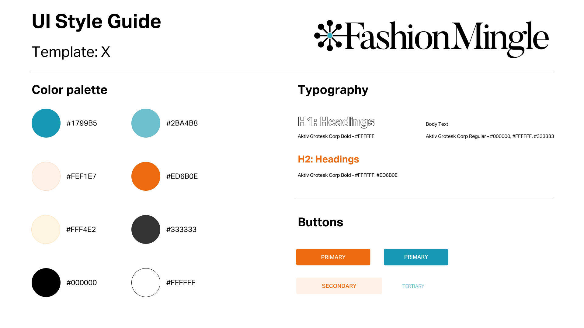
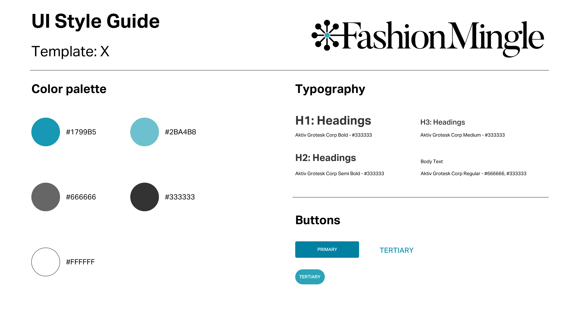
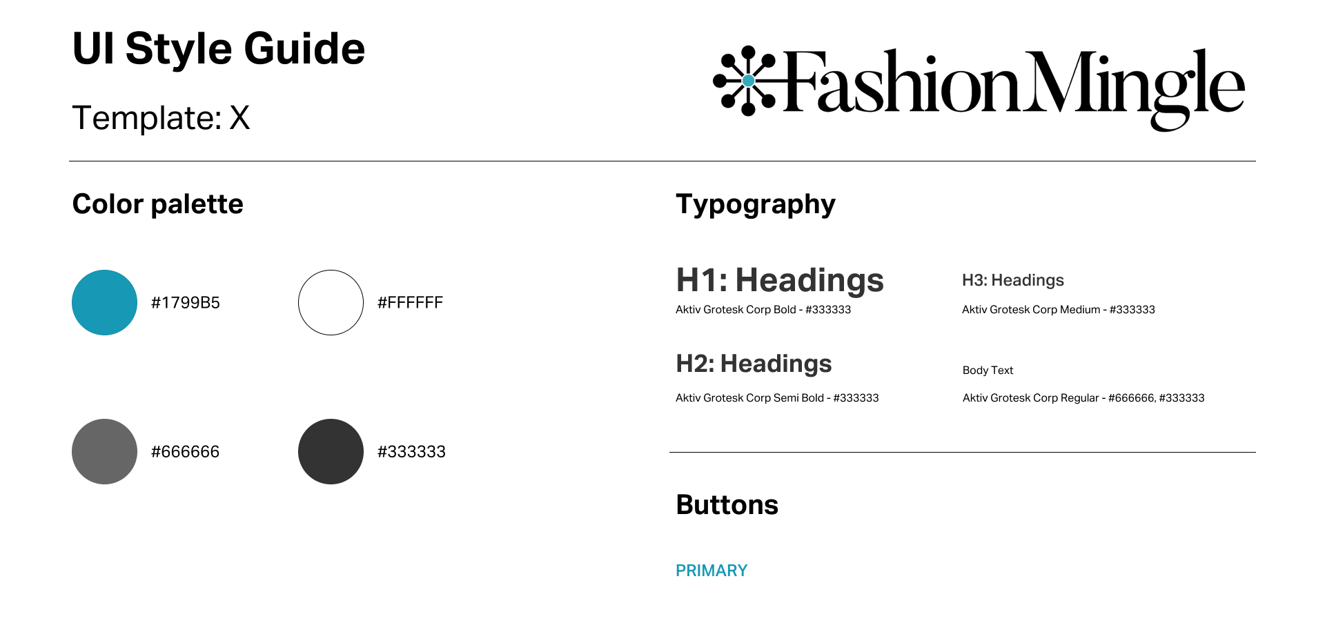
Because my team works with only one developer in a different region and timezone, my redesign will utilize the features, typography, etc. that are built-in with the WordPress template so that the team will not need to invest a significant amount of additional time and energy into learning how to update/edit the website.
COLOR
I added the orange, found in Fashion Mingle’s brand kit and career hub, for the main Call to Action buttons and titles so that the website would bring a fresh look to new users. According to my research for color psychology, orange symbolizes creativity and stimulates social interaction, so this was another reason why I decided to add the color. In addition, our old blue buttons, against the photograph we found for the new hero image, were not accessible. However, I kept the blue found on the original website and used it for accents, since that is part of our brand logo and the main color used for links and buttons throughout all of our pages on the site.
TYPOGRAPHY
The original homepage lacked typographic hierarchy. I kept the typeface used on the current website but played around with different weights and colors for different headings on the homepage, about us page, and press room page. Users that I spoke to pointed out that the typography changes helped them know where to look first and created a cohesive visual experience.
BUTTONS
There were too many different CTA buttons and no button hierarchy on the current website. I had to stay within the boundaries of the template, but I established 2 different buttons for the website redesign. In the redesign, I restructured the button hierarchy to create a clearer user journey. The original homepage featured two equal blue CTAs (“Join for Free” and “Member Dashboard”), which competed for attention and didn’t clearly guide new visitors toward conversion.
In the new design, “Join the Network” is established as the primary CTA with a bold, dark, orange background and white text, while “Explore Memberships” serves as the secondary CTA with a lighter orange background and dark orange text. This contrast introduces hierarchy, emphasizes the most important action, and supports Fashion Mingle’s transition toward a subscription-based model.
Homepage
About page
Press page
High-Fidelity Prototype
The Final Design: Clarity, Community, and Conversion
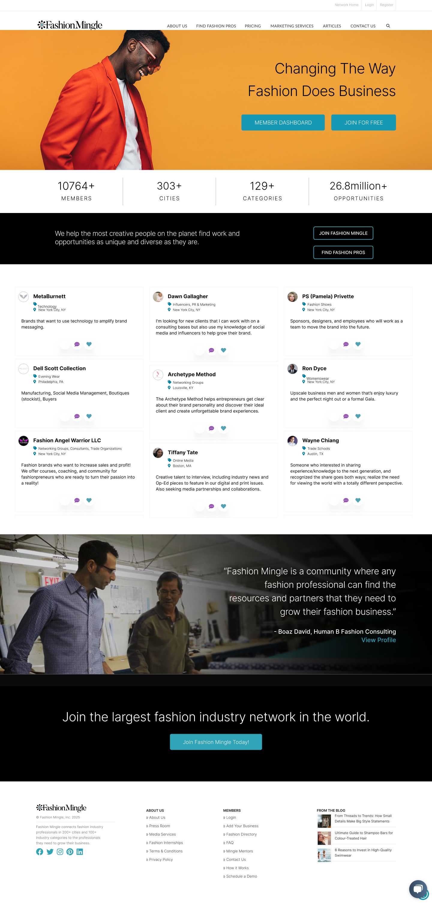
After synthesizing insights from my UX research, I developed a prototype of the main page that balanced user needs with the constraints of the existing template.
One of the primary goals was to create a clearer hierarchy for the call-to-action buttons, ensuring that users could immediately understand the next step to take.
I also replaced the generic hero image and unclear CTAs with visuals and messaging that better reflected Fashion Mingle’s community and purpose.
In addition, I refined the landing page content to make it more concise and user-focused, while brightening the overall color scheme to create a more engaging and inviting experience.
Here are screenshots before and after the website redesign:
Homepage
Before
After
About page
Before
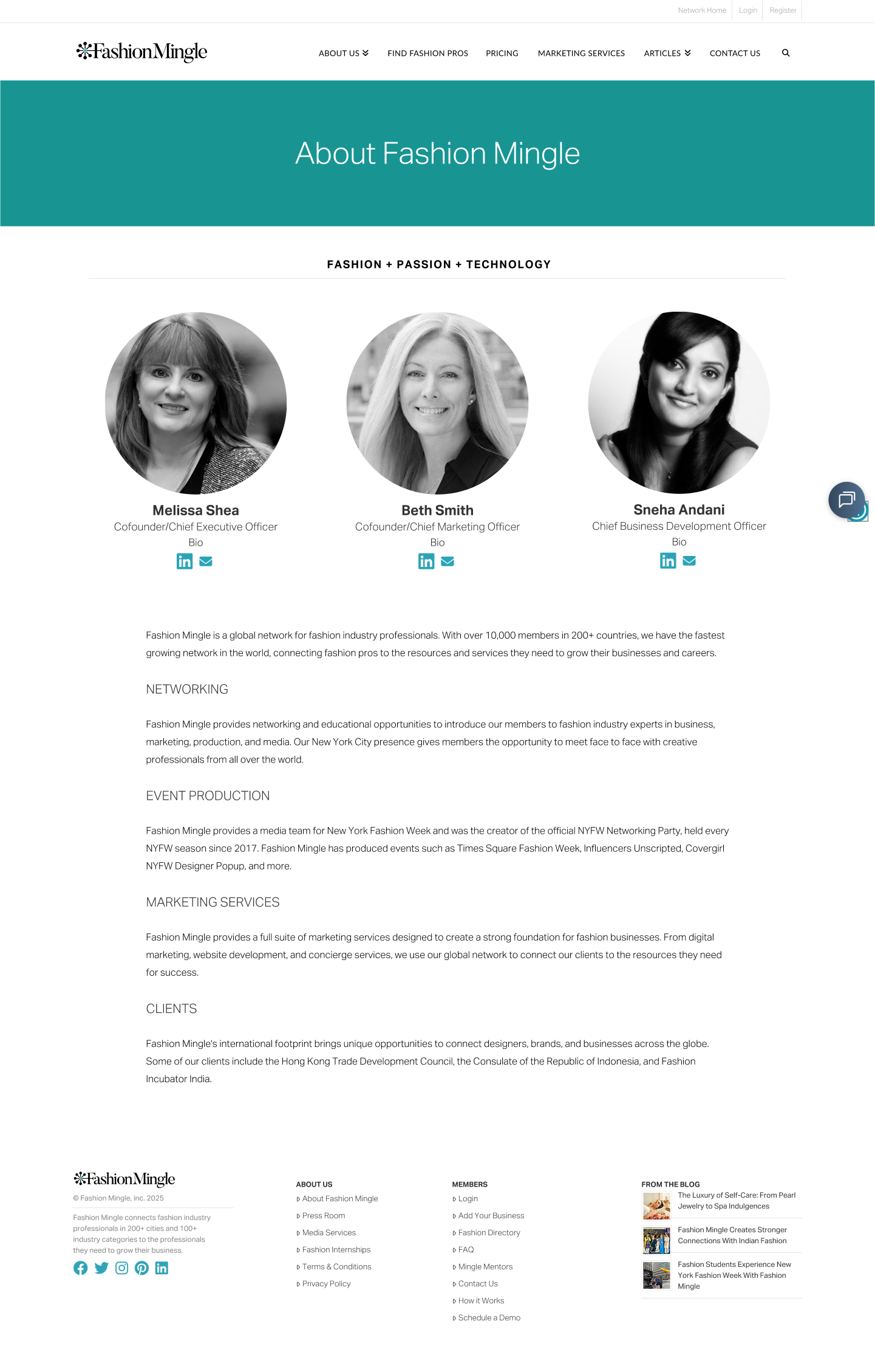
After
Press room page
Before
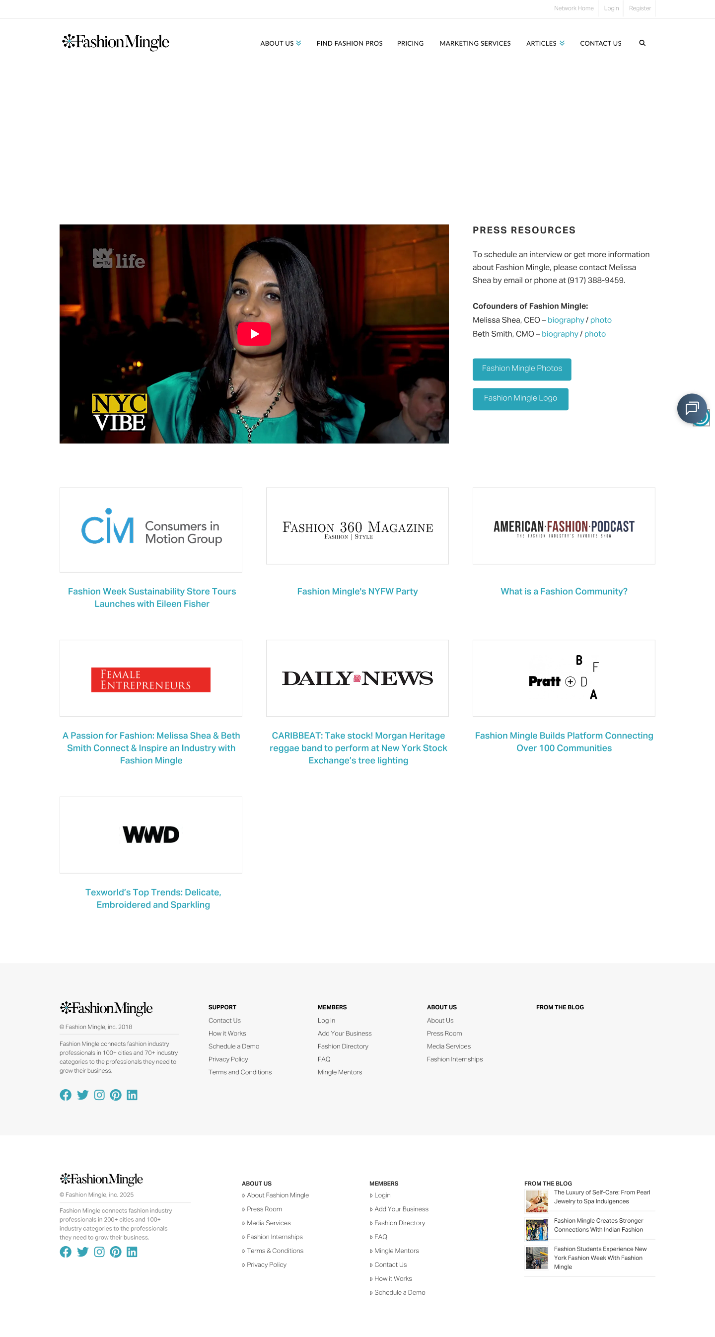
After
NAVIGATION
In the original design, the navigation bar created confusion for users trying to access the About Us page. When hovering over About Us in the top header, a dropdown menu appeared with two sub-options: Press Room and Fashion Shows. However, the About Us (Fashion Mingle) page itself was not listed within the dropdown. To access it, users had to know to click directly on the “About Us” text in the header: a behavior that wasn’t intuitive and often overlooked.
This design led to usability issues because the visual cue of the dropdown implied that the only available destinations were the listed sub-pages. Users who expected to see About Us in the dropdown were left uncertain or assumed it didn’t exist.
REDESIGN OPPORTUNITY
By restructuring the navigation, the About Us section was clarified and made directly accessible without requiring hidden interactions. This not only simplified navigation but also emphasized Fashion Mingle’s brand story and differentiation, which were critical goals for the redesign.

04 REFLECTION
The Fashion Mingle redesign project focused on improving the user experience of high-traffic pages, including the home/landing page, about us page, and press room page. The primary goal was to enhance clarity, simplify navigation, and present content in a visually engaging way that aligned with the brand identity.
Through this process, I learned the importance of prioritizing user needs on critical touchpoints. For example, the navigation to the About Us page was confusing in the original design, and addressing this revealed how small adjustments in labeling and hierarchy can significantly improve user comprehension. Attention to visual hierarchy, readability, and consistency helped create a more cohesive experience across pages.
What’s Next?
Conduct usability testing to validate changes and uncover further pain points
Refine the information hierarchy and layout based on user behavior analytics
Explore interactive or dynamic elements to increase engagement on high-traffic pages
Expand accessibility considerations, including responsive layouts and improved contrast for readability
What I Learned
Navigation clarity matters most on high-traffic pages.
Users should find key information in as few clicks as possible.
Consistency builds trust and professionalism.
Visual and content consistency across pages strengthens brand perception.
User feedback informs refinement.
Observing real interactions highlights subtle pain points that may be overlooked in initial designs.
Redesigning strategically
Focusing on the most-visited pages maximizes impact with limited resources.
Overall, this project reinforced the value of user-centered design and strategic prioritization, ensuring that the most critical pages provide an intuitive, visually engaging, and brand-consistent experience.
Thank you for taking the time to view my project. View more of my work below!