ZARA
Enhancing the Fashion E-Commerce Experience for Mobile-First Shoppers
01 OVERVIEW
Role
UX Designer and Researcher
Team
Solo Project
Challenge
Zara’s Online Platform Fails To Meet Modern Usability Standards
Zara is a globally recognized fashion brand with a strong online presence. Users commonly report issues such as poor navigation, lack of intuitive product discovery, slow loading times, and a checkout process that is not streamlined. These issues can frustrate users and lead to high bounce rates, cart abandonment, and lost sales.
Solution
Improve Digital Experience While Maintaining Brand Identity
To address the usability issues identified in Zara’s existing website, the redesign focused on three core principles: clarity, consistency, and conversion.
The three questions that I focused on were:
1. How can we streamline product discovery while maintaining Zara’s editorial and high-fashion visual identity?
2. What changes can improve the mobile shopping experience, especially in terms of speed and navigation flow?
3. How can the checkout process be redesigned to reduce cart abandonment and improve conversion?
Project Type
Website Redesign
02 RESEARCH
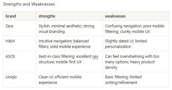
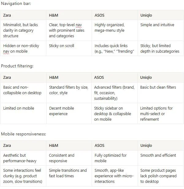
Competitive Analysis
The competition had simple, intuitive, and smooth user experiences.
When comparing Zara to three other fashion e-commerce websites, I found that all of them have global presence and adapt quickly to fashion trends. Then I looked at the websites’ features and found several differences. These differences gave direction for what is needed in the redesign.
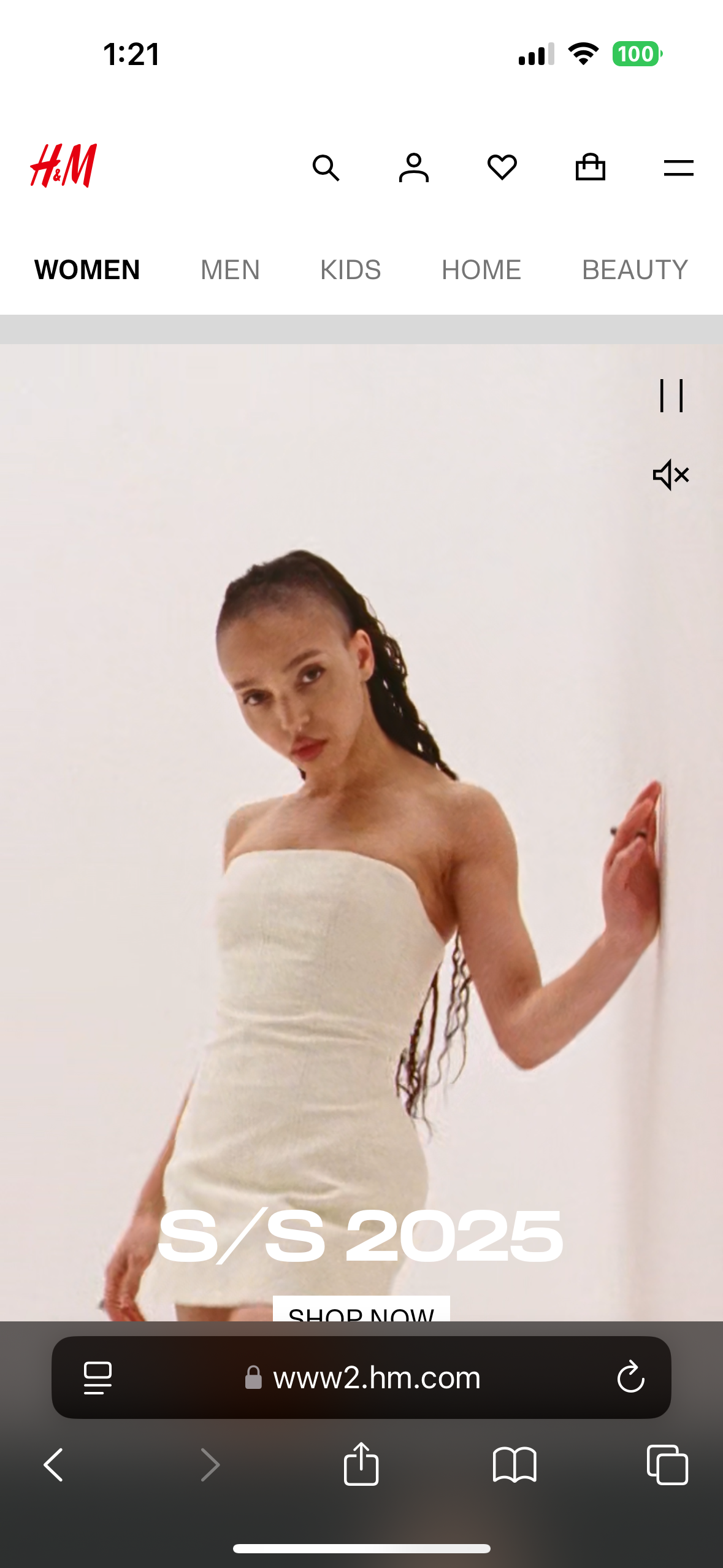
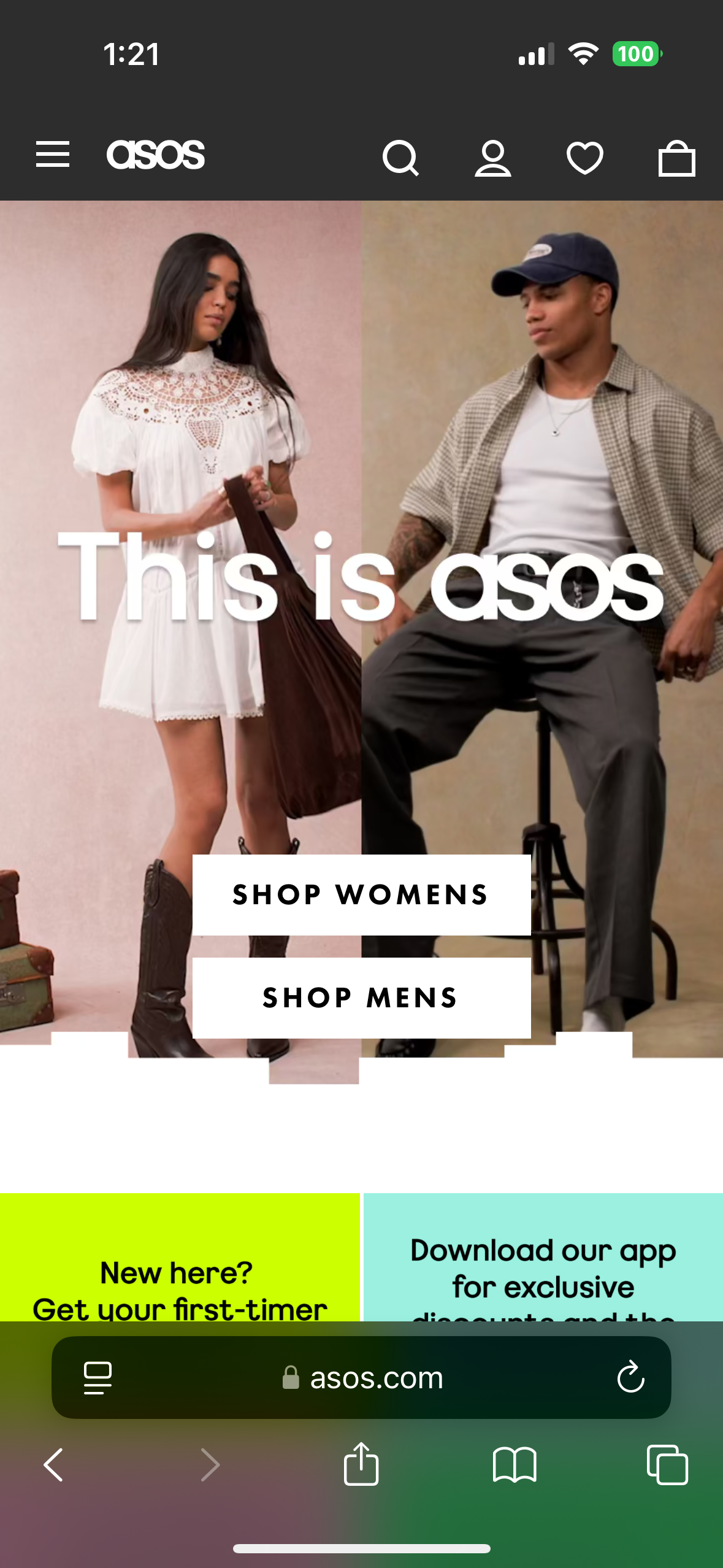
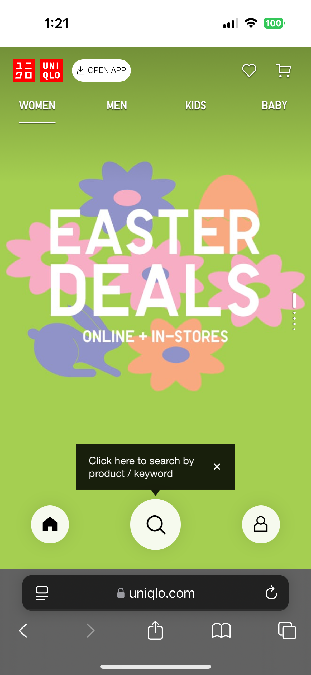
Below is a screenshot of Zara’s and other fashion e-commerce competitors’ website homepages:
User Surveys
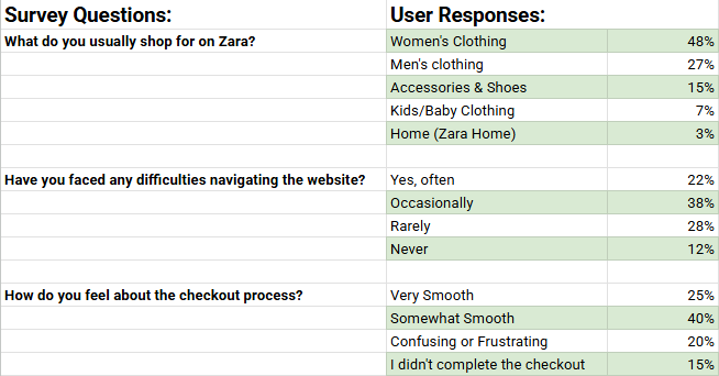
Survey results showed that users commonly experienced difficulties navigating and checking out on the website.
To gain a better understanding of the target audience, I conducted user surveys. The goal of the surveys was to gather valuable insights into the users’ pain points and areas of improvement for the website redesign. To identify pain points, some of the questions I asked during the surveys were:
From the user surveys, I found that:
Navigation challenges are common. 60% of users reported experiencing difficulties navigating the site at least occasionally. 22% said they face issues often, while 38% noted it happens occasionally, suggesting a strong need to improve the site’s navigation structure, labeling, and overall clarity.
The checkout experience has mixed reactions. A significant 35% experienced friction. 20% described the experience as confusing or frustrating and 15% didn’t complete checkout, which could signal potential drop-off issues or usability blockers.
There’s opportunity to enhance the mobile experience. Given Zara’s mobile-heavy user base (inferred from brand trends), and the reported checkout/navigation issues, mobile usability and speed may be contributing factors—calling for focused testing.
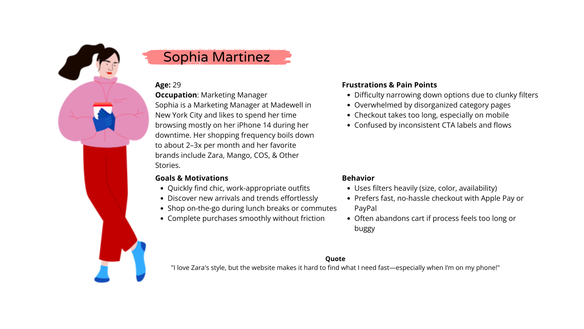
The Mobile-First Shopper Persona
Now that we have a deeper understanding of the user’s needs and frustrations, I created a fictional persona using the insights from the user interactions.
03 DESIGNS
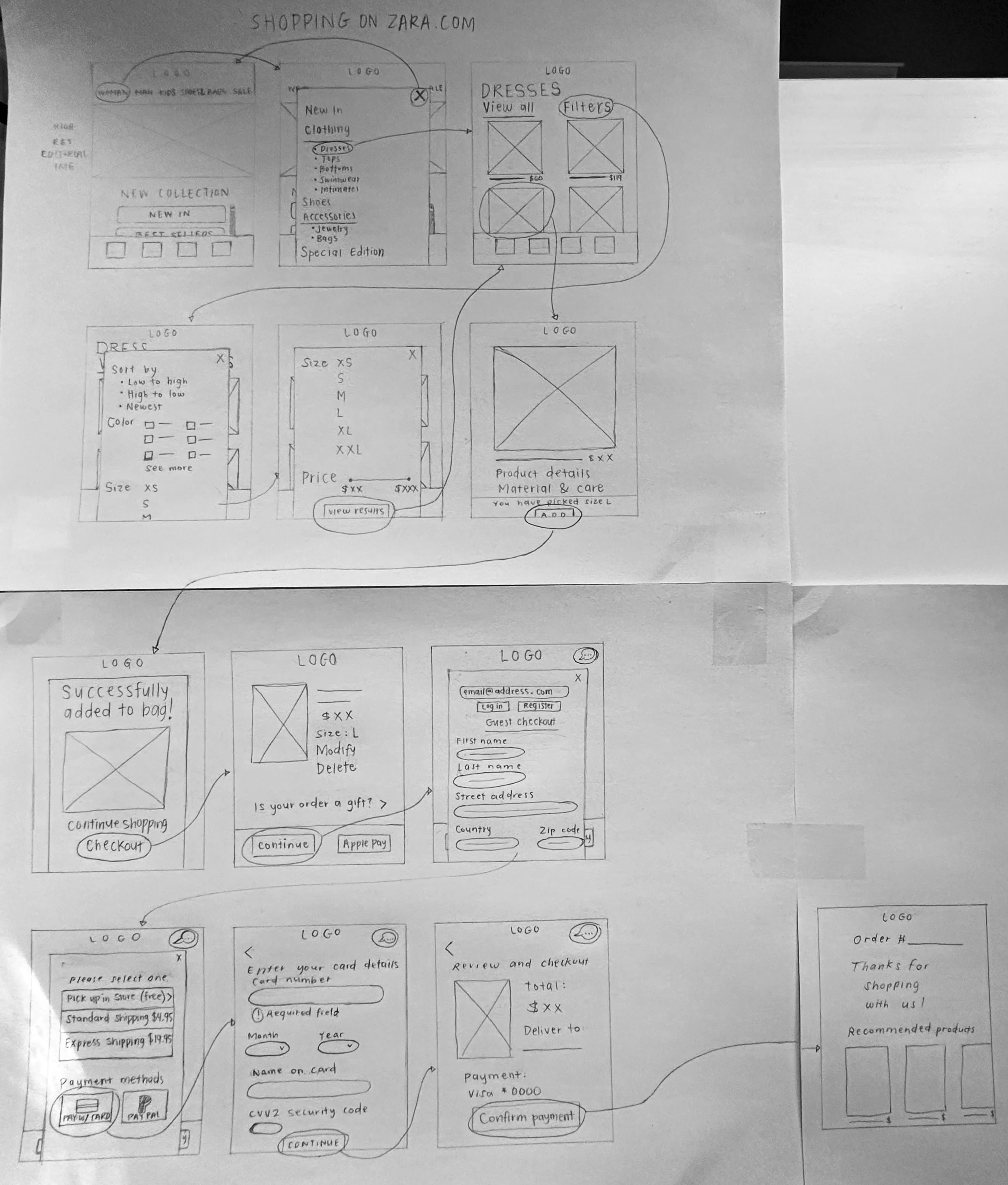
Sketches
Using the sitemap I created earlier, I began sketching the new website layout on a mobile screen. This process allowed me to quickly explore ideas and fine-tune the design. The sketches below emphasize streamlined filtering, adding to shopping bag, and the checkout process.
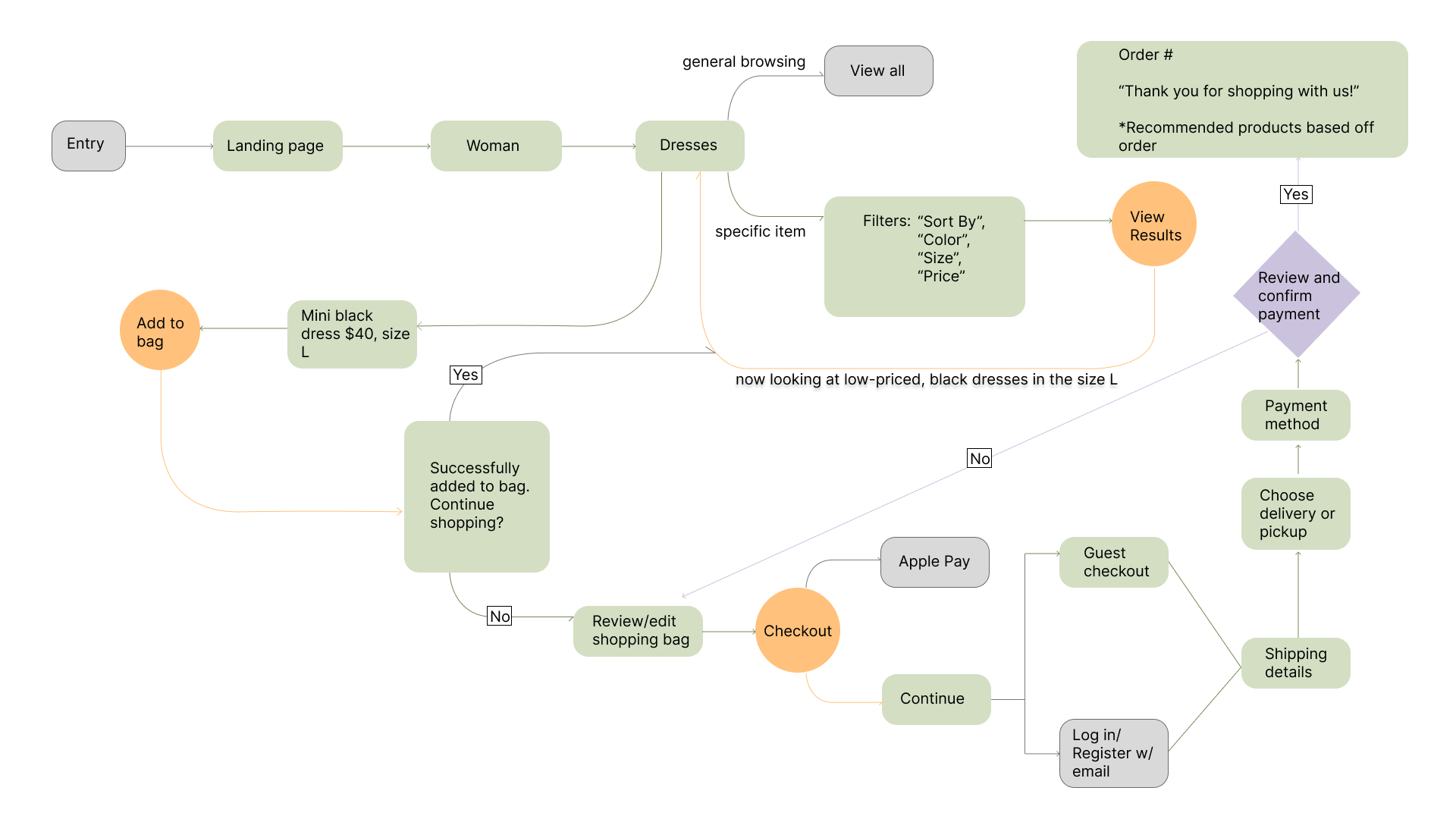
User flow
As an example of a user’s shopping experience, I constructed a user flow diagram, mapping out the experiences of a user browsing and filtering for a size L, inexpensive black dress, then adding the item to their shopping cart and completing the checkout process.
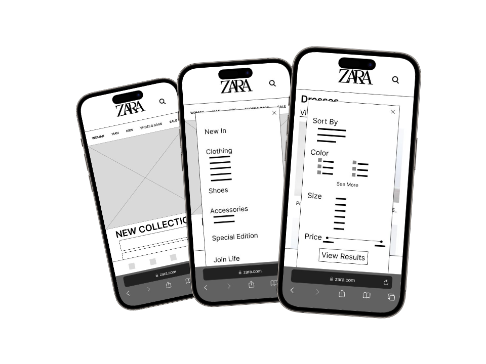
Wireframes
After finalizing the sketch layout and user flow, I moved on to translating those ideas into wireframes. To visualize the website's structure, I created some low-fidelity wireframes of the main pages using Figma.
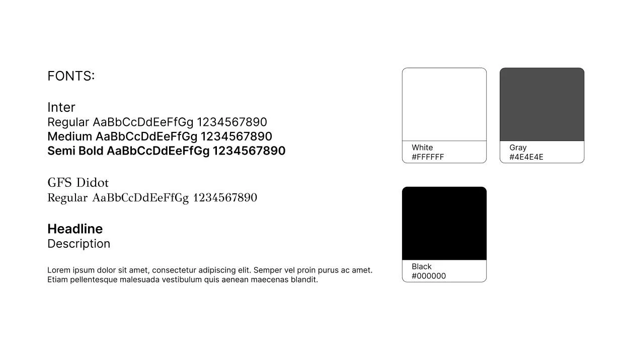
Visual Design
When implementing the color palette and typography, I decided to stick with monochromatic tones and simple fonts that represent Zara’s minimalist brand identity.
High-Fidelity Prototype
Simulating the Final User Experience With Realistic Visuals, Layout, and Interactivity Made for Mobile Devices.
This prototype allowed for effective testing of usability and user flows, ensuring that the redesigned site offered an intuitive and seamless shopping experience. The prototype acts a clear communication tool by showcasing detailed design elements such as typography, imagery, and responsive behavior. By identifying potential issues early and validating design decisions through usability testing and user feedback, the hi-fi prototype played a crucial role in refining the final design.
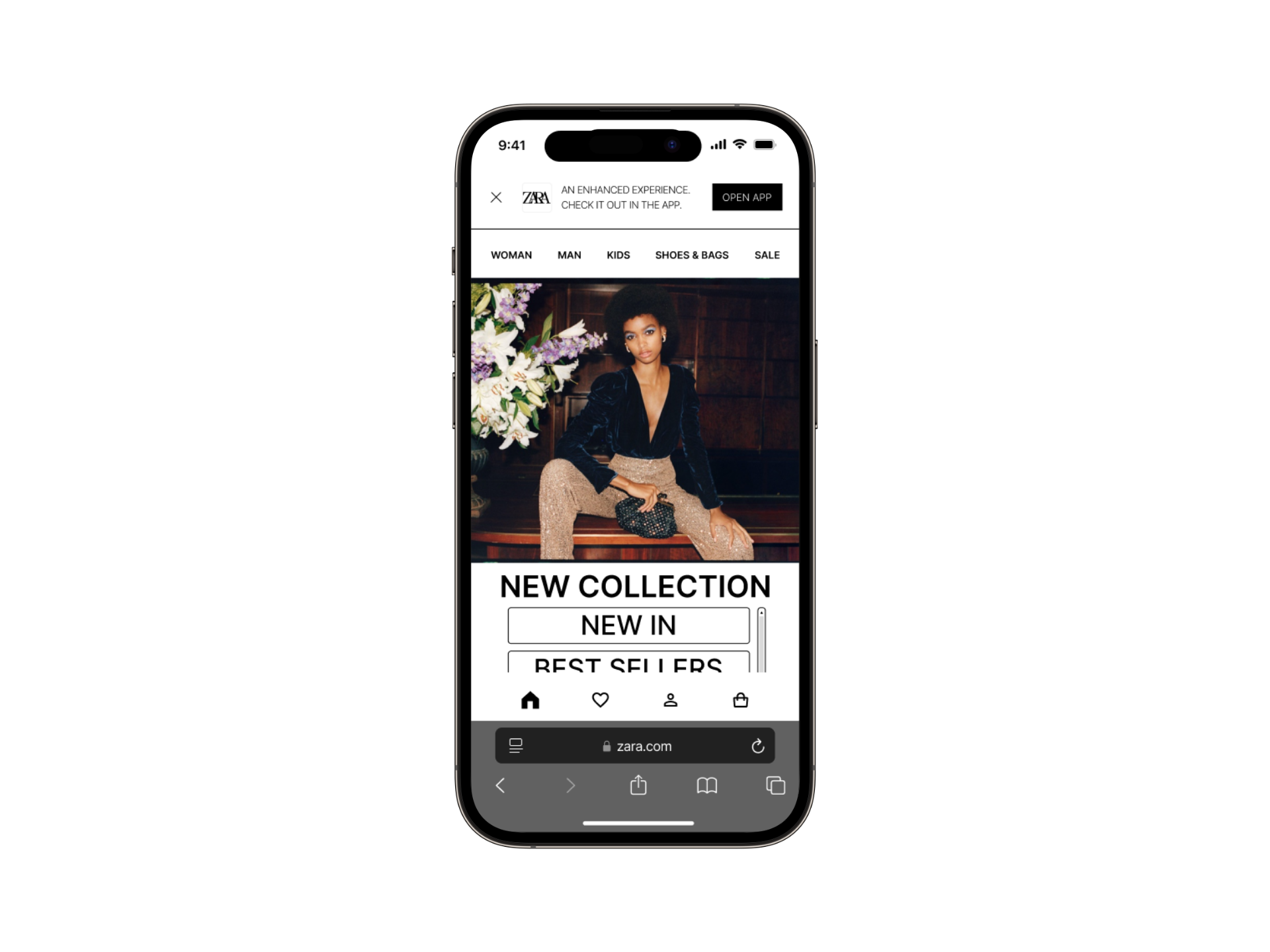
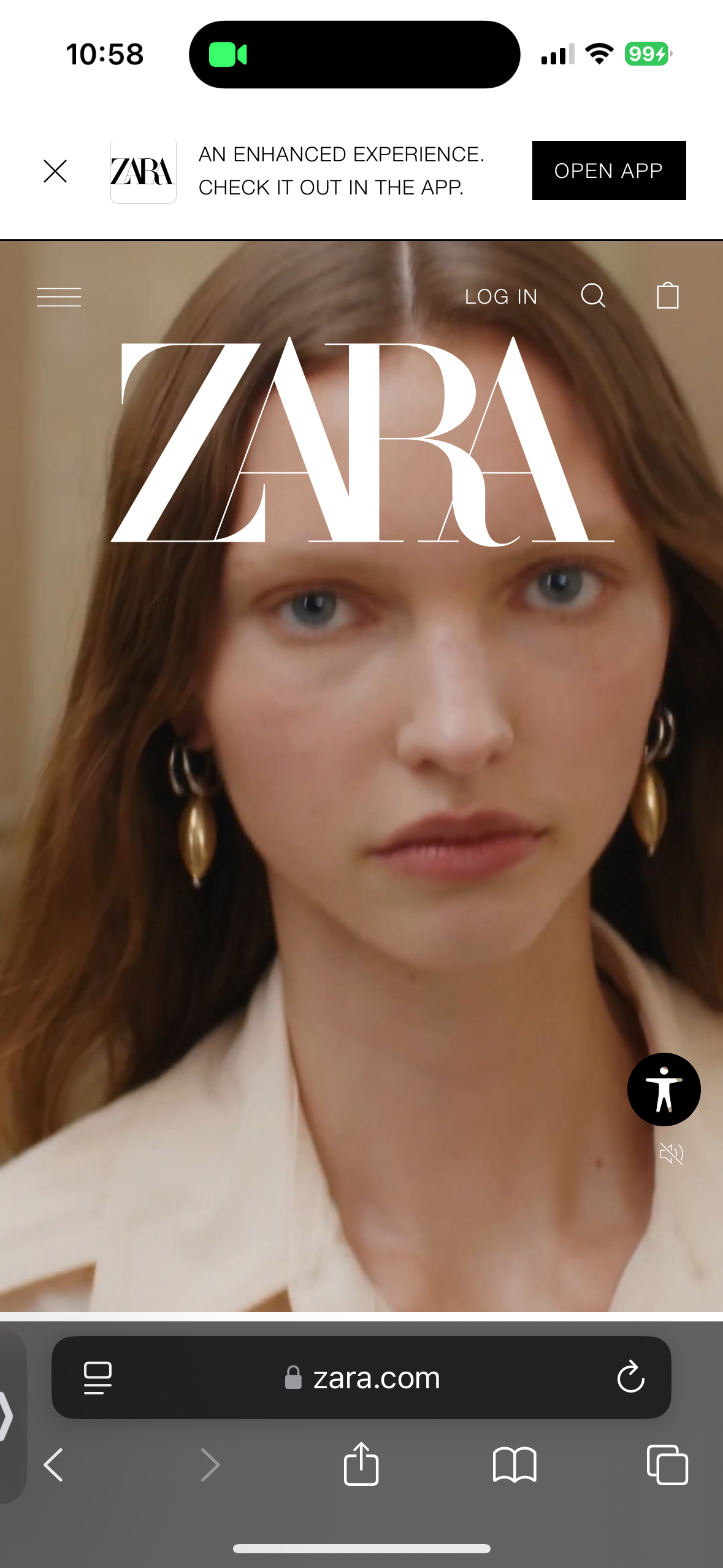
Here are screenshots before and after the website redesign:
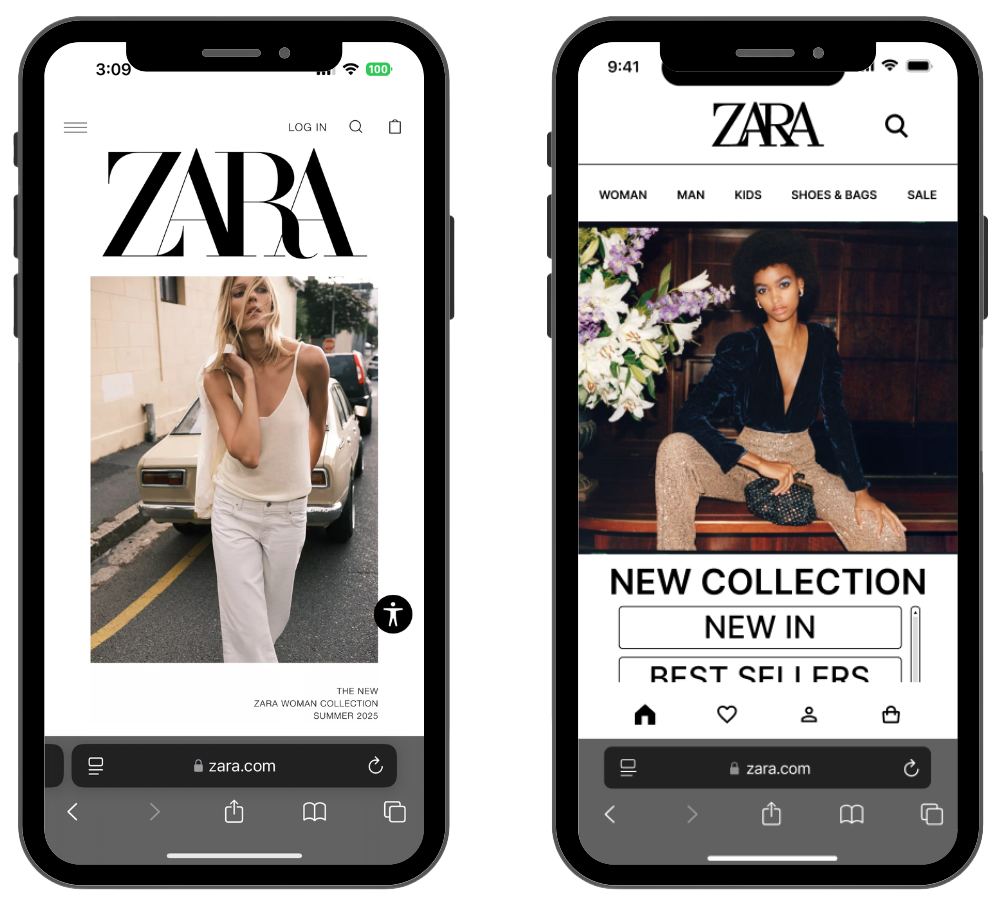
Homepage
Before
After
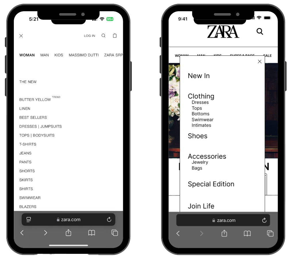
“Woman” shopping categories selections from nav bar
Before
After
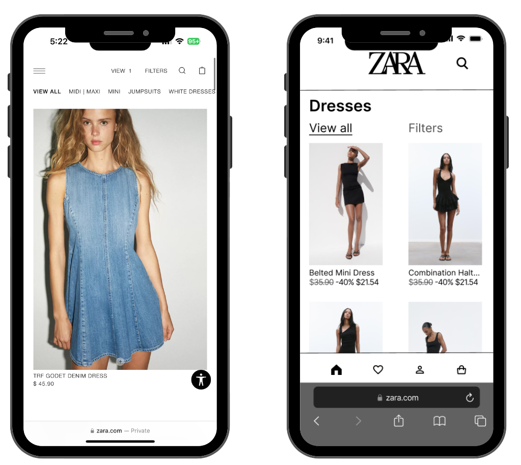
“View All” Dresses page
After
Before
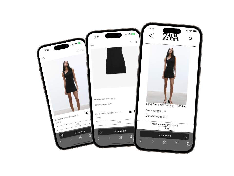
Before (left, middle)
After (right)
Selection page/add to cart
04 REFLECTION
Main Takeaways & What I would do differently.
This was my first passion project — a website redesign.
The project helped me realize and thoroughly understand Zara’s target audience, including their demographics, preferences, and pain points.
Focusing on the website’s mobile-first design version allowed me to gain a deeper understanding of essential UI elements for mobile design and highlighted the importance of accessibility. By taking on this personal project, I’ve strengthened my skills of being involved in iterative user testing which leads to better design.
One of the challenges I faced was balancing aesthetics with usability.
As potential next steps, I could start A/B testing or expanding improvements to and redesigning the mobile app version.
Thank you for taking the time to view my project. More work coming soon!